Brand Colours
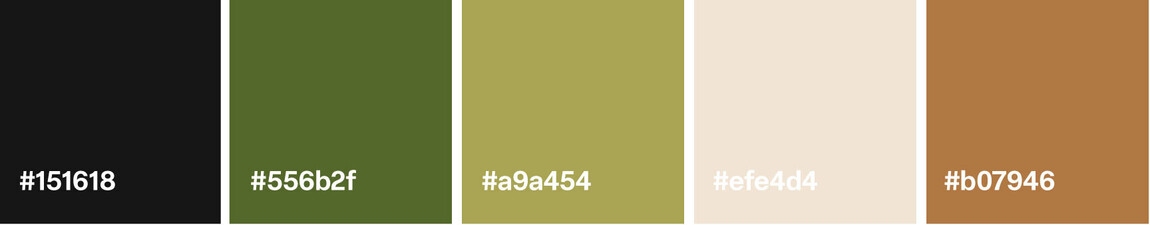
Colour is a powerful part of the Brewsy identity. Our palette reflects who we are: warm, inviting, and vibrant. Each shade has been carefully chosen to represent the spirit of our brand — from the richness of our brews to the freshness of our community.
The following colours form the foundation of the Brewsy palette. They should be used thoughtfully and consistently across all digital, print, and in-store materials to maintain a strong and unified presence.
Tip: Use colours consistently across all signage, marketing materials, and digital platforms.